7 Klaviyo mistakes that could be costing your Shopify store sales
Some of the biggest problems we find in Klaviyo accounts are surprisingly small.
Not “burn the whole account down and start again” problems.
More like:
❌ A button that's annoyingly difficult to tap.
❌ A welcome code that's been floating around the internet since 2022.
❌ A signup form asking for someone's life story before they've even decided whether they like you.
❌ An automated email nobody has looked at for three years.
Individually? Probably not catastrophic.
But when you've got little bits of friction dotted across your entire customer journey, they start adding up.
So here are seven things I'd go and check in your Klaviyo account today.
1. You're using the same welcome discount code for everyone
If your welcome email still says:
Use WELCOME10 for 10% off
I'd have a look at that.
Generic discount codes are easy to set up, but they're also very easy to share.
Someone joins your list, gets WELCOME10, posts it somewhere online and suddenly that supposedly exclusive new-subscriber offer isn't particularly exclusive.
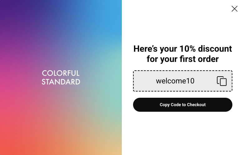
For Shopify brands using Klaviyo, unique discount codes can be a much better option.
Each subscriber receives their own code, and you can configure expiry rules around the offer.
That gives you genuine urgency too.
Instead of:
“HURRY! Your discount won't be around forever!!!”
…while WELCOME10 quietly continues working until 2037.
You can actually say:
Your code expires in 7 days.
And mean it.
What to check
Go into your welcome flow and look at the discount you're currently sending.
If everyone gets exactly the same code, check whether a unique Klaviyo coupon would make more sense for your setup.
Small fix. Much tidier.
2. You've never questioned your opt-in settings
Single opt-in. Double opt-in.
This isn't a setting I'd choose because someone once told you “double opt-in is best practice” and you haven't thought about it since.
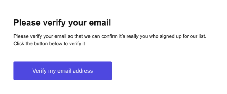
Double opt-in asks someone to confirm their subscription before they're added to your marketing list. Single opt-in doesn't require that extra confirmation step.
There can be perfectly good reasons for either setup, depending on your audience, where you're marketing and the consent requirements that apply to your business.
The important bit is:
Know which one you're using and why.
And don't confuse opt-in settings with list quality.
Whichever setup you use, you should still be paying attention to engagement and regularly cleaning genuinely unengaged profiles from your sending segments.
What to check
Find out whether your Klaviyo list is using single or double opt-in.
If the answer is “erm…”, there's your first job.
Then make sure your setup is appropriate for your business and the marketing/privacy rules that apply to you.
3. Your CTA buttons are tiny
Please get your phone out for this one.
Open one of your emails.
Now try to tap the CTA with your thumb.
Easy?
Lovely.
Have to perform microsurgery to hit SHOP NOW without accidentally opening something else?
We have a problem.
Your email CTA should be obvious and easy to tap on a small screen.
As a general accessibility/usability guideline, we usually want buttons to have a comfortable tap area rather than a teeny bit of text floating in space. Around 44px+ is a useful minimum touch-target reference, although the right design depends on the email.
And give the poor thing some breathing room.
What to check
Send yourself your latest campaign and actually open it on your phone.
Can you immediately see what you're supposed to click?
Can you comfortably tap it with your thumb?
If not, make it easier.
4. I can't tell what you want me to do next
This is different from having a tiny button.
Sometimes we open an email and there are:
Three products.
Five links.
Two different buttons.
A blog article.
An Instagram link.
A “learn more.”
A “shop now.”
And somewhere near the bottom, a completely different CTA.
What do you actually want me to do?
Every marketing email should have a clear next step.
That doesn't mean you can only have one button in the entire email.
You might repeat the same CTA near the top, beside products and again at the bottom.
But there should be a clear primary action you're trying to get someone to take.
What to check
Look at your latest email and ask:
“If someone gives this three seconds of attention, will they know what I want them to do?”
If you have to explain it, simplify it.
5. Your signup form wants my entire autobiography
First name.
Last name.
Email.
Phone number.
Birthday.
Dog's maiden name.
Favourite Spice Girl.
I only wanted 10% off, Susan.
Every additional field gives someone another reason to decide they can't be bothered.
That doesn't mean customer data isn't valuable. It absolutely is.
Knowing someone's birthday, product interests, preferences or other useful information can help you create much better email marketing.
But you don't necessarily have to collect everything at the first hello.
For lots of Shopify brands, email is the essential bit.
Get them onto the list.
Then look for sensible opportunities to learn more about them over time.
What to check
Open your signup form and count how many things you're asking someone to do before they can subscribe.
Then ask:
Do I genuinely need every one of these right now?
If you don't use the information to change the customer's experience, I'd especially question why you're collecting it.
6. You've forgotten about everything that happens after the email
Your email might look gorgeous.
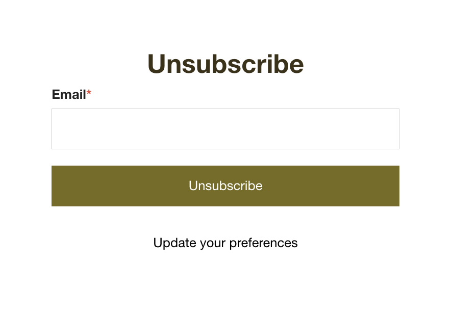
Then someone clicks unsubscribe and lands on a page that looks like it was created by a fax machine. 😂
Your unsubscribe page is still part of your brand.
So are your preference pages, confirmation pages, signup success messages and all the other slightly boring bits of the email journey that don't get anywhere near as much design attention.
They don't need to be works of art.
But they should feel like they belong to you.
And sometimes there are useful little opportunities hiding there too.
Someone unsubscribing from your campaigns might prefer to hear from you less frequently, for example, rather than disappearing altogether.
What to check
Go through your email journey like a customer.
Sign up. Confirm. Click. Manage preferences. Unsubscribe.
Look at every page you land on.
Anything weird, generic, outdated or off-brand?
Add it to the fix list.
7. You only email when you've got something to sell
This is probably the biggest one on the list.
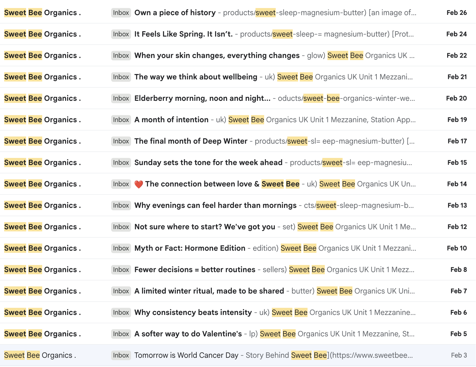
If your campaign calendar looks like:
SALE
silence
NEW PRODUCT
silence
20% OFF
silence
PLEASE BUY SOMETHING
…we need more to talk about.
You don't have to email every day.
And I'm certainly not suggesting you fill people's inboxes for the sake of consistency.
But I do want you to give people reasons to hear from your brand between purchases and promotions.
Teach them something.
Help them choose.
Show them how to get more from what they've bought.
Share something interesting.
Tell them what's happening behind the scenes.
Make them laugh.
Be worth hearing from even when they aren't ready to buy today.
Because someone can love your brand and simply not need your product this week.
Staying interesting keeps you familiar until they do.
What to check
Look at your last 10 campaigns.
How many asked someone to buy something?
And how many gave them something useful, interesting or entertaining without the sale being the entire point?
If the answer is 10 out of 10 selling, that's where I'd start.
Your 10-minute Klaviyo check
Right. Open your account.
You don't need to conduct a full audit today.
Just check these seven things:
❓ Is your welcome discount unique or generic?
❓ Do you know whether you're using single or double opt-in, and why?
❓ Are your CTA buttons easy to tap on mobile?
❓ Does every campaign have an obvious next step?
❓ Is your signup form asking for more information than you actually need?
❓ Have you checked your unsubscribe and preference experience lately?
❓ Are you emailing when you DON'T have something to sell?
Found one?
Fix that one first.
Found five?
Okayyyyy. We might need to talk. 👀
The little things are usually telling you something bigger
None of these things alone is going to magically double your Klaviyo revenue overnight.
That's not the point.
The point is that when we audit an account, we're looking at the whole journey.
What happens when someone first discovers you?
What gets them onto the list?
What happens after they subscribe?
What do they see on mobile?
What happens when they click?
What happens when they buy?
And what makes them want to stick around?
Sometimes it's a big strategic gap.
Sometimes it's a 32px button.
Both are worth spotting.
Want us to find the stuff you've stopped noticing?
When you're inside your own Klaviyo account every day, it's very easy to stop seeing the weird little things.
That's exactly what The Email Fix is for.
We get properly nosy inside your Klaviyo account, work out what's working, what's not and where you're leaving opportunities on the table.
Then you get a clear, prioritised plan of exactly what we'd fix first.
No “optimise your customer journey” fluff.
Actual things to go and do.