
Email design best practices for product businesses

If you're running a product-based business, you already know that email marketing is the gift that keeps on giving. But here's the twist: the wrapping paper matters just as much as the present inside. That's right, we're diving into the world of email design, and I promise it's going to be more exciting than unwrapping a mystery box!
Here we go, 15 ways to make your emails look nicer and convert better.

1. The perfect Klaviyo template does exist
Just like a perfectly ironed shirt, your emails should be clean and crisp. Start with a clutter-free layout that showcases your products flawlessly. Avoid the temptation to stuff your email with every product you offer. It's like trying to fit a herd of elephants into a Mini Cooper – not a pretty sight! Struggling with getting the formatting just right in Klaviyo? Grab my plug-n-play Klaviyo template for Shopify businesses.

2. Eye-catching images
Imagine receiving a blurry selfie from a friend. Not great, right? The same goes for your product images. Invest in high-quality, drool-worthy visuals that make your products shine. Trust me; your subscribers will thank you by clicking and buying! I said high quality, but keep an eye on image size. Aim for images to be as small as possible without losing the magic (less than 200kb).

3. Choose a palette that pops
Colours can evoke emotions, so choose your palette wisely. Keep your brand colours consistent and add complementary shades to create visual harmony. Don't go overboard and turn your email into a neon disco party – unless that's your brand's vibe! Your emails should be an extension of your website, so start there. Adding background colour to text blocks can help break the content up too.

4. Font tips for email newsletters
Fonts are like the voice of your email. Make sure your choice is legible, reflects your brand personality, and maintains consistency across all emails. Mixing too many fonts is like having a conversation with five people at once – it gets confusing! Use one of Klaviyo’s default fonts for your body copy (Arial, Helvetica, Century Gothic etc.) so that it displays correctly on all devices and in all inboxes. The next best thing is sticking to Google Fonts only.

5. "One size fits all"
Mobile users are your BFFs, so design your emails with them in mind. Test your email on a mobile! Send it to yourself and check it. Is all the right info above the fold? Are there weird line breaks? Remember, if your email doesn't fit their screen, it's like Cinderella's glass slipper – beautiful but not a perfect fit!

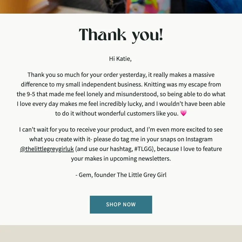
6. Engaging CTAs
Call-to-action buttons are your email's cheerleaders. Make them pop by using contrasting colours and action-oriented text. Avoid “SHOP NOW” like the plague. Try something that no other brand could use. Instead of "SHOP ALL," try something like "Get the Party Started!" – it's more enticing!

7. Let it breathe
White space is the email designer's secret sauce. It gives your content room to breathe and makes it more readable. Think of it as the pause in a killer joke – it enhances the punchline!

8. Test, test, test
Before hitting that "Send" button, give your email a dress rehearsal. Check for broken links, wonky images, and won't-render-right-on-Internet-Explorer quirks. Testing is like a safety net – it catches the embarrassing falls!

9. Be GIF-ted
Add some sparkle to your emails with GIFs. They're like the fireworks of email design – attention-grabbing and delightful. Use them sparingly and purposefully to accentuate key messages or products. Watch out for file size though, too big and they’ll slow the email down so test it and go for text-based GIFs as opposed to moving image GIFs.
10. Make it personal
Nothing grabs attention like seeing your name in lights. Or, in this case, in your inbox. Use personalisation tags to make your subscribers feel special. It's like having a personal shopper, but it's your email doing the styling!

11. Less is more
In the world of email design, brevity is king. Craft concise and compelling copy that gets to the point. Remember, your subscribers' time is precious – don't waste it with endless paragraphs.

12. Subject lines: tease and please
Your subject line is the first impression, so make it count. Be clever, be intriguing, but please, don't be clickbait. It's like promising a unicorn and delivering a pony – disappointing! It also breaks the trust you’ve so carefully built with your customers and subscribers.

13. Unsubscribe should be easy
Sometimes, subscribers bid adieu. Make the unsubscribe process easy and graceful. Don’t look at who specifically unsubscribed, people leave mailing lists for 1000X reasons. If your unsubscribe rate is over 1% though, things have got to change. You’re either attracting the whole people to your list, or your content isn’t good enough to keep them around. Aim for 0.5% or lower.

14. Mobile preview
Don't skip the mobile preview. Check how your email looks on smartphones. I said it at the top, I’m saying it again. Test your emails on a mobile before scheduling and sending. 90% of your customers will be reading it on their phones, so don’t skip this step.

15. Measure and improve
Lastly, embrace the magic of analytics. Track open rates (not as reliable as they used to be), click-through rates (I prefer Click Rate), and conversions (that’s Placed Order Rate on Klaviyo). Use the data to fine-tune your email content.
That’s it, some of the best things you can do to create magical and stand-out emails. Remember, email marketing is all about the experience for your customers and soon-to-be-customers. Get this right and you’ll see your Klaviyo-attributed revenue increase.
Are you still with me?? And love tips like this?